Build production-ready, responsive layouts in React
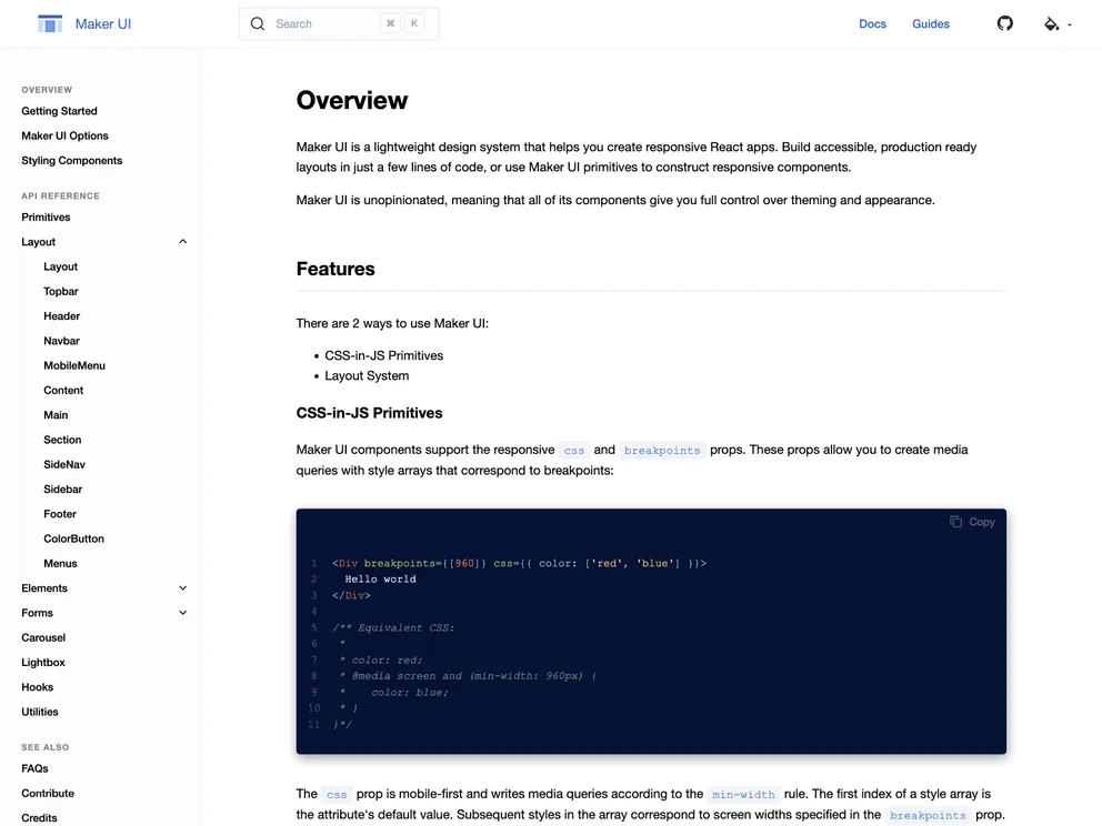
Maker UI is a tool that allows users to build responsive React apps with a customizable layout system powered by Emotion. It aims to simplify the process of designing accessible and responsive apps, allowing users to focus on creating content and adding new features to their projects. With Maker UI, users can quickly deploy production-ready layouts and customize them in any way they want. The tool offers a range of features, including fully customizable CSS Grid-based header layouts, common page layouts, responsive navigation, accessible dropdown menus, and more.
To install Maker UI, follow these steps:
npm install @maker-ui/core
or
yarn add @maker-ui/core
import { LayoutProvider, BaseLayout } from '@maker-ui/layouts';
import { Header, Menu, Main, Footer } from '@maker-ui/sections';
<LayoutProvider>
  <BaseLayout>
    <Header>
      {/* Content for header */}
    </Header>
    <Menu>
      {/* Content for menu */}
    </Menu>
    <Main>
      {/* Content for main section */}
    </Main>
    <Footer>
      {/* Content for footer */}
    </Footer>
  </BaseLayout>
</LayoutProvider>
Maker UI is a powerful tool for building responsive React apps with customizable layouts. It offers a range of features that simplify the design process and allow users to focus on content creation and feature development. With its responsive layout system powered by Emotion, Maker UI enables users to create accessible and fully customizable apps. By providing pre-built components and support for responsive CSS arrays, Maker UI streamlines the development process and eliminates the need for writing media queries. Overall, Maker UI is a valuable resource for React developers looking to create responsive and visually appealing apps.

