shadcn/ui is a collection of beautifully designed, accessible, and customizable UI components for React, built on top of Radix UI and styled with Tailwind CSS. Shadcn revolutionized UI libraries with a copy-paste model, giving developers full control without dependencies. Its component registry l...
Admin UI Kit with Material UI & Nextjs. Next.js 13+ compatibility, 2 stunning dashboards, 9 ready-to-use applications, code splitting, Google Fonts, RTL support, i18n support, Redux toolkit integration, Axios mock API, a Next.js landing page, and Figma design files for seamless customization. Str...

Mobile-first, accessible components for React Native & Web to build consistent UI across Android, iOS and Web.

UI Library for Design Engineers. Animated components and effects you can copy and paste into your apps. Free. Open Source.

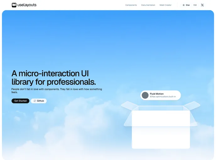
UI kit to make beautiful, animated interfaces, faster. Customizable. Open Source.

npm for design engineers: largest marketplace of shadcn/ui-based React Tailwind components, blocks and hooks

Beautiful and responsive UI components and templates for React and Vue (soon) with Tailwind CSS.

Components crafted for Design Engineers. Styled using Tailwind CSS, fully compatible with Shadcn, and easy to integrate—just copy and paste. MIT

Tail-kit is a free and open source components and templates kit fully coded with Tailwind css 3.0.

React content transition slider. Awesome Slider is a 60fps, light weight, performant component that renders an animated set of production ready UI general purpose sliders with fullpage transition support for NextJS and GatsbyJS.

Professional-grade background patterns and gradients for your websites and apps. Easily copy and paste into your next project. Crafted with modern CSS and Tailwind for seamless integration.

A mcp server to allow LLMS gain context about shadcn ui component structure,usage and installation,compaitable with react,svelte 5,vue & React Native

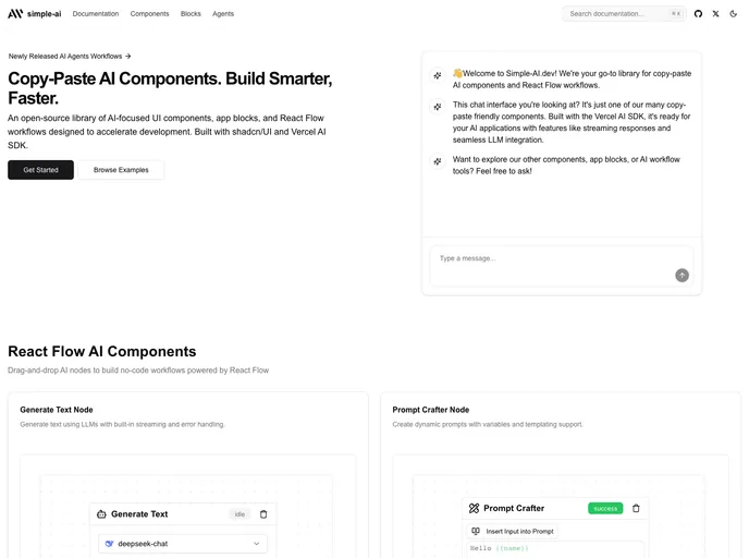
Core building blocks for AI apps. High-quality, accessible, and customizable components for AI interfaces.
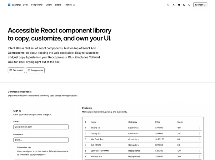
Intent UI is a chill set of React components, built on top of React Aria Components and Tailwind CSS. Easy to customize and just copy & paste into your React projects.

Intent UI is a chill set of React components, built on top of React Aria Components and Tailwind CSS. Easy to customize and just copy & paste into your React projects.

Intent UI is a chill set of React components, built on top of React Aria Components and Tailwind CSS. Easy to customize and just copy & paste into your React projects.

Intent UI is a chill set of React components, built on top of React Aria Components and Tailwind CSS. Easy to customize and just copy & paste into your React projects.

Startup is free Next.js template for SaaS startups comes with all the essential pages, components, and sections you need to launch a complete business website.

Eldora UI is a collection of re-usable components that you can copy and paste into your web apps. It primarily features components, blocks, and templates.

CLI for adding customizable and re-usable chat components to your applications. Build beautiful chat interfaces in minutes.

The Magic Patterns Catalog is an open-source website that lists the most popular React component libraries, helping you find the perfect component.

The Magic Patterns Catalog is an open-source website that lists the most popular React component libraries, helping you find the perfect component.
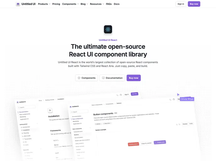
Untitled UI React is the world’s largest collection of open-source React components built with Tailwind CSS and React Aria. Just copy, paste, and build.
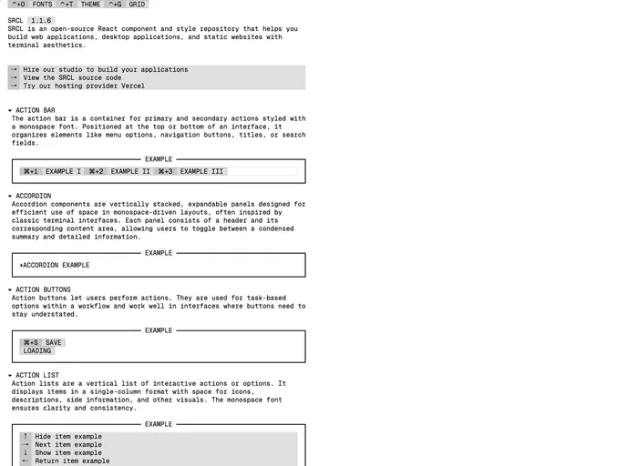
SRCL is an open-source React component and style repository that helps you build web applications, desktop applications, and static websites with terminal aesthetics.

Keep React is an open-source component library built on Tailwind CSS and React.js. It provides a versatile set of pre-designed UI components to build modern web applications.

UI component library for React, Next.js, and other JSX frameworks. Built with Tailwind CSS, it makes creating beautiful, interactive and responsive interfaces fast and easy.
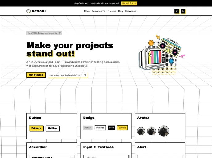
A NeoBrutalism styled React + TailwindCSS UI library for building bold, modern web apps.

A NeoBrutalism styled React + TailwindCSS UI library for building bold, modern web apps.

Spectrum UI is a collection of re-usable components built using Aceternity UI Magic UI and ShadCN UI that you can copy and paste into your apps.
A collection of beautifully designed AI interface components that you can copy and paste into your apps. Accessible. Customizable. Open Source.

Next.js admin dashboard template and UI components that come with pre-built elements, components, pages, high-quality design, integrations, and much more.

Planner Component: A React component for dynamic appointment management. Features drag-and-drop, date range selections, and integrates with shadcn/ui. Perfect for developers enhancing apps with efficient scheduling capabilities.
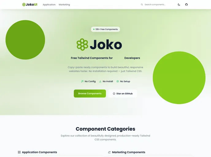
Free Open Source Tailwind CSS Component for Sat-set Developers with Zero Configuration, Installation, and Setup

The next gen UI made with simple HTML and Tailwind CSS. It's compatible with simple HTML, CSS static website or a React, Vue, Angular or Next.js Complex app. Zero JS and no-plugins installed.

Customizable and re-usable timeline component for you to use in your projects. Built on top of shadcn.

Solid is a free Next.js template specifically crafted for startups, SaaS, and software websites.

Craft your applications for productivity and meet your users’ expectations by enhancing your Mantine-based UIs with a desktop-grade, lightweight yet fully-featured, dark-theme aware context-menu component, built by the creator of Mantine DataTable.

Ory Elements is a component library that makes building login, registration and account pages for Ory a breeze.
Free premium animated React components and micro-interactions built with Framer Motion and Tailwind CSS

OpenAI and Next.js starter kit, built to assist innovators in developing AI-based SaaS applications. This OpenAI starter kit and boilerplate includes pre-configurations, OpenAI examples, integrations, key components, business pages, and features to help you launch your AI startup quickly.
